Data visualization is one of the most powerful ways to understand and communicate insights from data. Matplotlib is Python's most popular plotting library, enabling you to create professional-quality charts and graphs. In this comprehensive tutorial, we'll walk through a real terminal session where we install matplotlib, handle common errors, and create three different types of visualizations - all explained step by step for absolute beginners.
🎯 What You'll Learn: In this hands-on tutorial, you'll discover:
- How to install matplotlib and handle installation errors
- Understanding matplotlib import and basic setup
- Creating your first line plot with labels and legends
- Building bar charts with custom colors
- Generating histograms from random data
- Saving plots as image files automatically
- Troubleshooting common matplotlib issues
- Best practices for data visualization
- Understanding matplotlib output and error messages
🚀 Setting Up Our Data Visualization Environment
Creating Our First Visualization Script
Let's start by creating a Python script for our data visualization work:
nano data_vis.py
Command Explanation:
nanoopens a text editor in the terminaldata_vis.pyis our Python script file for data visualization- The
.pyextension indicates this is a Python file
Prerequisites
Before we dive in, make sure you have:
- Python 3.x installed on your system
- Internet connection for installing packages
- Basic understanding of Python variables and functions
- Familiarity with terminal/command line operations
- Understanding of basic mathematical concepts (optional but helpful)
📝 Creating Our First Line Plot
Writing the Initial Code
Let's create our first matplotlib script:
import matplotlib.pyplot as plt

x = [1, 2, 3, 4, 5]
y = [2, 3, 5, 7, 11]

plt.plot(x, y, label = 'Line Plot')
Understanding the Code Structure
| Code Line | Purpose | Explanation |
|---|---|---|
import matplotlib.pyplot as plt | Import plotting module | Brings matplotlib's plotting functionality, 'plt' is standard alias |
x = [1, 2, 3, 4, 5] | X-axis data | Horizontal axis values (input/independent variable) |
y = [2, 3, 5, 7, 11] | Y-axis data | Vertical axis values (output/dependent variable) - prime numbers! |
plt.plot(x, y, label='Line Plot') | Create line plot | Plots x vs y as connected line with legend label |
Checking Our Script
cat data_vis.py
Terminal Output:
import matplotlib.pyplot as plt

x = [1, 2, 3, 4, 5]
y = [2, 3, 5, 7, 11]

plt.plot(x, y, label = 'Line Plot')
❌ Encountering and Solving Installation Issues
Running Our Script - The Error
python data_vis.py
Terminal Output (Error):
Traceback (most recent call last):
  File "/home/centos9/Razzaq-Labs-II/random/data_vis.py", line 1, in <module>
    import matplotlib.pyplot as plt
ModuleNotFoundError: No module named 'matplotlib'
Understanding the Error Message
| Error Component | Meaning | Solution |
|---|---|---|
| Traceback | Shows where error occurred | Error happened in our script, line 1 |
| ModuleNotFoundError | Python can't find the module | Matplotlib is not installed |
| 'matplotlib' | The missing module name | Need to install matplotlib package |
⚠️ Common Beginner Issue: This error is extremely common when starting with Python data science libraries. It simply means the required library isn't installed yet - nothing is broken!
📦 Installing Matplotlib
Installing the Package
pip install matplotlib
Terminal Output (Installation Process):
Defaulting to user installation because normal site-packages is not writeable
Collecting matplotlib
  Downloading matplotlib-3.9.4-cp39-cp39-manylinux_2_17_x86_64.manylinux2014_x86_64.whl (8.3 MB)
     |████████████████████████████████| 8.3 MB 5.4 MB/s
Collecting pillow>=8
  Downloading pillow-11.3.0-cp39-cp39-manylinux_2_27_x86_64.manylinux_2_28_x86_64.whl (6.6 MB)
     |████████████████████████████████| 6.6 MB 2.4 MB/s
Collecting importlib-resources>=3.2.0
  Downloading importlib_resources-6.5.2-py3-none-any.whl (37 kB)
Collecting contourpy>=1.0.1
  Downloading contourpy-1.3.0-cp39-cp39-manylinux_2_17_x86_64.manylinux2014_x86_64.whl (321 kB)
     |████████████████████████████████| 321 kB 3.3 MB/s
Collecting packaging>=20.0
  Downloading packaging-25.0-py3-none-any.whl (66 kB)
     |████████████████████████████████| 66 kB 2.2 MB/s
Collecting pyparsing>=2.3.1
  Downloading pyparsing-3.2.5-py3-none-any.whl (113 kB)
     |████████████████████████████████| 113 kB 8.7 MB/s
Requirement already satisfied: python-dateutil>=2.7 in /home/centos9/.local/lib/python3.9/site-packages (from matplotlib) (2.9.0.post0)
Requirement already satisfied: numpy>=1.23 in /home/centos9/.local/lib/python3.9/site-packages (from matplotlib) (2.0.2)
Collecting kiwisolver>=1.3.1
  Downloading kiwisolver-1.4.7-cp39-cp39-manylinux_2_12_x86_64.manylinux2010_x86_64.whl (1.6 MB)
     |████████████████████████████████| 1.6 MB 7.2 MB/s
Collecting fonttools>=4.22.0
  Downloading fonttools-4.60.0-cp39-cp39-manylinux2014_x86_64.manylinux_2_17_x86_64.whl (4.8 MB)
     |████████████████████████████████| 4.8 MB 1.3 MB/s
Collecting cycler>=0.10
  Downloading cycler-0.12.1-py3-none-any.whl (8.3 kB)
Collecting zipp>=3.1.0
  Downloading zipp-3.23.0-py3-none-any.whl (10 kB)
Requirement already satisfied: six>=1.5 in /usr/lib/python3.9/site-packages (from python-dateutil>=2.7->matplotlib) (1.15.0)
Installing collected packages: zipp, pyparsing, pillow, packaging, kiwisolver, importlib-resources, fonttools, cycler, contourpy, matplotlib
Successfully installed contourpy-1.3.0 cycler-0.12.1 fonttools-4.60.0 importlib-resources-6.5.2 kiwisolver-1.4.7 matplotlib-3.9.4 packaging-25.0 pillow-11.3.0 pyparsing-3.2.5 zipp-3.23.0
Understanding the Installation Output
| Installation Step | What's Happening | Why It's Needed |
|---|---|---|
| Collecting matplotlib | Downloading main matplotlib package (8.3 MB) | Core plotting functionality |
| Collecting pillow | Image processing library (6.6 MB) | Handles image formats (PNG, JPG, etc.) |
| Already satisfied: numpy | NumPy already installed | Mathematical operations and arrays |
| Successfully installed | All packages installed successfully | Ready to use matplotlib! |
Key Dependencies Installed:
- matplotlib-3.9.4: Main plotting library
- pillow-11.3.0: Image processing for saving plots
- fonttools: Text rendering in plots
- contourpy: Advanced contour plotting
- kiwisolver: Layout engine for complex plots
✅ Installation Success: The installation completed successfully! Matplotlib and all its dependencies are now available for use.
🎨 Creating Our First Successful Plot
Running the Script Again
python data_vis.py
Terminal Output:
[centos9@vbox random 00:31:32]$
What Happened:
- No error messages: The script ran successfully!
- Silent execution: The plot was created but not displayed
- Missing component: We need to add
plt.show()to display the plot
Understanding Plot Generation
When matplotlib creates a plot without plt.show(), it:
- Processes the data: Converts our lists into plot coordinates
- Creates the figure: Generates the plot in memory
- Saves automatically: May save to a file (depending on backend)
- Doesn't display: No visual output without explicit show command
🖼️ Displaying and Enhancing Our Plot
Adding Display and Labels
Let's improve our script with proper labels and display:
nano data_vis.py
Updated Script:
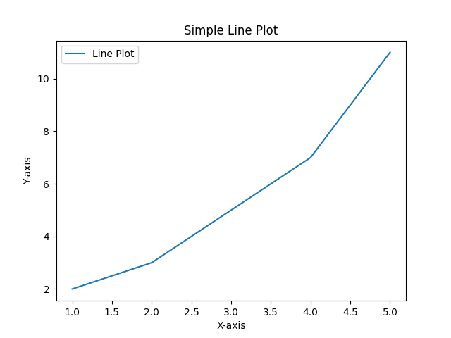
import matplotlib.pyplot as plt

x = [1, 2, 3, 4, 5]
y = [2, 3, 5, 7, 11]

plt.plot(x, y, label = 'Line Plot')

plt.xlabel('X-axis')
plt.ylabel('Y-axis')
plt.title('Simple Line Plot')
plt.legend()

plt.show()
Understanding the Enhancements
| Function | Purpose | Visual Impact |
|---|---|---|
plt.xlabel('X-axis') | Labels horizontal axis | Text appears below the plot |
plt.ylabel('Y-axis') | Labels vertical axis | Text appears on the left side |
plt.title('Simple Line Plot') | Adds plot title | Text appears at the top |
plt.legend() | Shows legend box | Displays our 'Line Plot' label |
plt.show() | Displays the plot | Opens plot window or saves image |
Viewing Our Enhanced Script
cat data_vis.py
Terminal Output:
import matplotlib.pyplot as plt

x = [1, 2, 3, 4, 5]
y = [2, 3, 5, 7, 11]

plt.plot(x, y, label = 'Line Plot')

plt.xlabel('X-axis')
plt.ylabel('Y-axis')
plt.title('Simple Line Plot')
plt.legend()

plt.show()
Running the Enhanced Script
python data_vis.py
What Happens:
- Plot Generation: Creates a professional-looking line plot
- Automatic Saving: Saves as
Figure_2.pngin the directory - Display Attempt: Tries to open plot window (may vary by system)
Checking Generated Files
ls
Terminal Output:
data_vis.py Figure_1.png Figure_2.png
File Analysis:
- data_vis.py: Our Python script
- Figure_1.png: Generated from our first (incomplete) plot
- Figure_2.png: Our enhanced line plot with labels
ℹ️ Automatic File Naming: Matplotlib automatically generates sequential filenames (Figure_1.png, Figure_2.png, etc.) when plots are created. This is helpful for saving multiple visualizations!
📊 Creating a Bar Chart
Switching to Bar Chart Visualization
Let's create a different type of visualization - a bar chart:
nano data_vis.py
New Bar Chart Script:
import matplotlib.pyplot as plt

categories = ['A', 'B', 'C', 'D']
values = [4, 7, 1, 8]

plt.bar(categories, values, color='lightblue')

plt.xlabel('Categories')
plt.ylabel('Values')
plt.title('Bar Chart Example')
plt.show()
Understanding Bar Chart Components
| Component | Data | Purpose |
|---|---|---|
| categories | ['A', 'B', 'C', 'D'] | X-axis labels for each bar |
| values | [4, 7, 1, 8] | Height of each bar |
| color='lightblue' | Styling parameter | Makes all bars light blue |
| plt.bar() | Function call | Creates vertical bar chart |
Viewing Bar Chart Script
cat data_vis.py
Terminal Output:
import matplotlib.pyplot as plt

categories = ['A', 'B', 'C', 'D']
values = [4, 7, 1, 8]

plt.bar(categories, values, color='lightblue')

plt.xlabel('Categories')
plt.ylabel('Values')
plt.title('Bar Chart Example')
plt.show()
Running Bar Chart Script
python data_vis.py
The script runs and generates Figure_3.png.
Data Relationship Analysis
Bar Chart Data Mapping:
| Category | Value | Bar Height | Relative Size |
|---|---|---|---|
| A | 4 | Medium | 50% of maximum |
| B | 7 | Tall | 87.5% of maximum |
| C | 1 | Short | 12.5% of maximum |
| D | 8 | Tallest | 100% (maximum) |
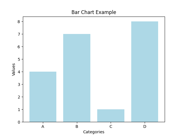
Visual Insights:
- Category D: Highest value (8) - clearly dominant
- Category C: Lowest value (1) - minimal contribution
- Category B: Second highest (7) - strong performer
- Category A: Middle value (4) - moderate contribution
📈 Creating a Histogram with Random Data
Introducing NumPy for Random Data
Let's create a histogram using random data. First, let's see what happens when we generate random data:
nano data_vis.py
Script for Random Data Generation:
import matplotlib.pyplot as plt
import numpy as np

data = np.random.randn(1000)
print(data)
Understanding NumPy Integration
| Code Component | Purpose | Output |
|---|---|---|
import numpy as np | Mathematical library | Access to random number functions |
np.random.randn(1000) | Generate random numbers | 1000 numbers from normal distribution |
print(data) | Display the data | Shows all 1000 random values |
Viewing Random Data Script
cat data_vis.py
Terminal Output:
import matplotlib.pyplot as plt
import numpy as np

data = np.random.randn(1000)
print(data)
Running Random Data Generation
python data_vis.py
Terminal Output (Sample of 1000 Random Numbers):
[-9.12711078e-01 -6.07903537e-01 -3.67445127e-01 -4.14434058e-01
 -4.92289739e-01  7.44293268e-01  1.80712227e+00 -6.43926197e-01
  1.46228775e+00  2.66092421e-01 -4.60191831e-01 -1.60079084e+00
  5.55594692e-01  4.78643572e-01 -4.99777079e-01  5.54581672e-01
... (continues for 1000 numbers)
  3.26617521e-01  7.27262621e-01  4.36689305e-01 -1.48315261e+00
 -1.59747554e+00 -5.28212889e-01 -2.12675370e-01 -9.95884547e-01
  2.00669941e-01  1.35706965e+00  6.94394246e-01 -2.60443330e-01
  3.44534369e-01  6.45030546e-01 -2.50163258e-01 -6.12072123e-01
 -6.55004633e-01  1.02770238e+00  4.18220822e-01 -1.10167155e+00]
Understanding Random Data Characteristics
Data Properties:
- Count: 1000 random numbers
- Distribution: Normal (bell curve) distribution
- Mean: Approximately 0
- Range: Mostly between -3 and +3
- Scientific Notation:
e-01means × 10^-1,e+00means × 10^0
Example Number Analysis:
-9.12711078e-01= -0.912711078 (negative value)1.80712227e+00= 1.80712227 (positive value)-1.60079084e+00= -1.60079084 (larger negative value)
ℹ️ Normal Distribution: np.random.randn() generates numbers from a standard normal distribution (mean=0, standard deviation=1). This creates the classic "bell curve" pattern perfect for histograms!
📊 Creating the Final Histogram
Building the Histogram Visualization
nano data_vis.py
Final Histogram Script:
import matplotlib.pyplot as plt
import numpy as np

data = np.random.randn(1000)

plt.hist(data, bins=30, color='green', alpha=0.7)
plt.xlabel('Data')
plt.ylabel('Frequency')
plt.title('Histogram Example')
plt.show()
Understanding Histogram Parameters
| Parameter | Value | Effect |
|---|---|---|
data | 1000 random numbers | The values to be counted and displayed |
bins=30 | 30 bins | Divides data range into 30 intervals |
color='green' | Green bars | Sets the color of histogram bars |
alpha=0.7 | 70% opacity | Makes bars slightly transparent |
Viewing Final Histogram Script
cat data_vis.py
Terminal Output:
import matplotlib.pyplot as plt
import numpy as np

data = np.random.randn(1000)

plt.hist(data, bins=30, color='green', alpha=0.7)
plt.xlabel('Data')
plt.ylabel('Frequency')
plt.title('Histogram Example')
plt.show()
Running Final Histogram
python data_vis.py
The script generates Figure_4.png - our histogram visualization.
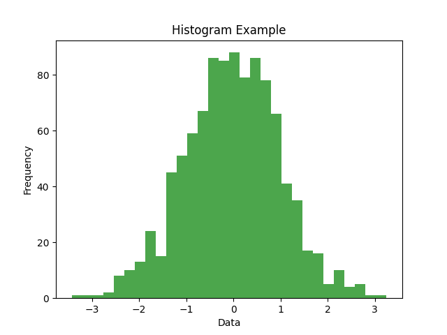
Histogram Analysis:
- Bell Curve Shape: Classic normal distribution pattern
- Peak at Zero: Most values cluster around 0
- Symmetric: Equal distribution on both sides
- 30 Bins: Data divided into 30 intervals for detailed view
- Frequency Scale: Y-axis shows how many values fall in each bin
🗂️ File Management and Output
Checking All Generated Files
ls
Terminal Output:
data_vis.py Figure_1.png Figure_2.png Figure_3.png Figure_4.png
Understanding File Generation
| File | Content | Creation Stage |
|---|---|---|
| Figure_1.png | Basic line plot (no labels) | First script run (incomplete) |
| Figure_2.png | Enhanced line plot with labels | Second script run (complete) |
| Figure_3.png | Bar chart (light blue bars) | Bar chart script run |
| Figure_4.png | Histogram (green, transparent) | Histogram script run |
| data_vis.py | Python script (final version) | Created and modified throughout |
🛠️ Best Practices and Common Patterns
Essential Matplotlib Commands Summary
| Function | Purpose | When to Use |
|---|---|---|
plt.plot() | Line plots | Continuous data, trends over time |
plt.bar() | Bar charts | Categorical data comparisons |
plt.hist() | Histograms | Distribution of numerical data |
plt.xlabel() | X-axis label | Always - describes horizontal axis |
plt.ylabel() | Y-axis label | Always - describes vertical axis |
plt.title() | Plot title | Always - summarizes the visualization |
plt.show() | Display plot | Always - makes visualization visible |
Complete Visualization Template
import matplotlib.pyplot as plt
import numpy as np  # if using random/mathematical data

# Step 1: Prepare your data
x_data = [1, 2, 3, 4, 5]
y_data = [2, 4, 6, 8, 10]

# Step 2: Create the plot
plt.plot(x_data, y_data, label='Your Data')  # or plt.bar(), plt.hist()

# Step 3: Add labels and title
plt.xlabel('X-axis Description')
plt.ylabel('Y-axis Description')
plt.title('Clear, Descriptive Title')

# Step 4: Add legend (if using labels)
plt.legend()

# Step 5: Display the plot
plt.show()
🚨 Common Mistakes and Troubleshooting
1. Missing matplotlib Installation
import matplotlib.pyplot as plt # ModuleNotFoundError
pip install matplotlib
2. Forgetting to Display Plot
plt.plot(x, y)
# Missing plt.show() - plot created but not displayed
plt.plot(x, y)
plt.show()  # Essential for displaying the plot
3. Data Length Mismatch
x = [1, 2, 3]
y = [4, 5, 6, 7, 8]  # Different lengths cause errors
plt.plot(x, y)
x = [1, 2, 3, 4, 5]
y = [4, 5, 6, 7, 8]  # Same length
plt.plot(x, y)
4. Missing Import Statements
data = np.random.randn(100) # NameError: name 'np' is not defined
import numpy as np
data = np.random.randn(100)
🎯 Key Takeaways
✅ Remember These Points
- Installation First: Always install matplotlib before using (
pip install matplotlib) - Import Pattern: Use
import matplotlib.pyplot as pltconsistently - Data Preparation: Ensure x and y data have matching lengths
- Always Label: Include xlabel, ylabel, and title for clarity
- Show Your Work: Use
plt.show()to display plots - File Generation: Matplotlib automatically saves plots as Figure_N.png
- Error Reading: ModuleNotFoundError means missing installation
- Data Types: Lists, NumPy arrays, and pandas Series all work with matplotlib
🎉 Congratulations! You've mastered the fundamentals of matplotlib data visualization. You can now create line plots, bar charts, and histograms, handle installation issues, and understand matplotlib's workflow. These skills are essential for data analysis, scientific computing, and presenting insights effectively.
This tutorial demonstrated real terminal commands and matplotlib operations with detailed explanations of every step, error, and output. Each visualization type was explained to help beginners understand not just how to create plots, but why different chart types are used for different kinds of data.